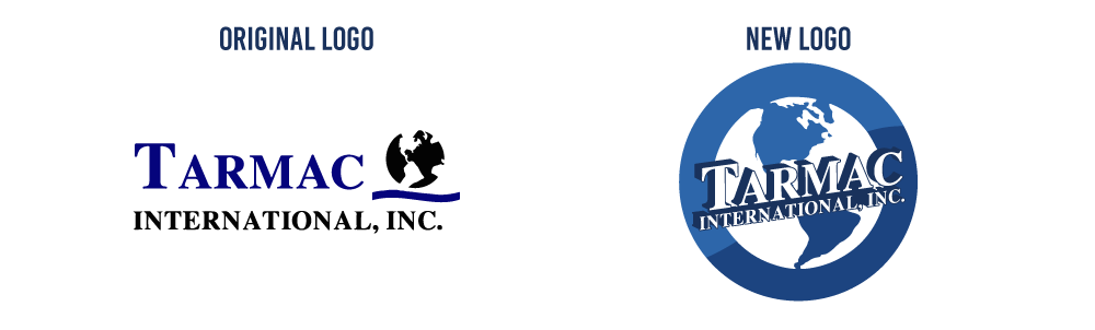
I began design work for Tarmac International, Inc in the fall of 2013. Tarmac International is a small company without a structured design department. When I arrived it was important for me to re-brand Tarmac with a few elements they were lacking: Standardized color codes, fonts, and logos to use across various marketing materials.
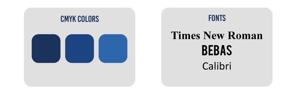
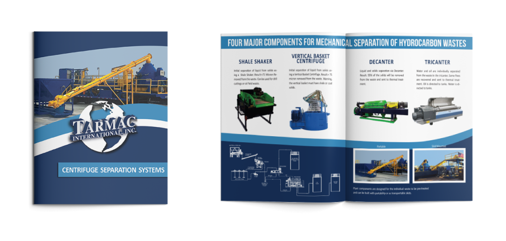
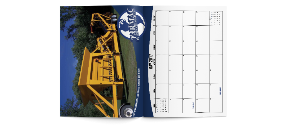
The company wanted to keep elements such as the globe, the blue color scheme, and Times New Roman, as a prevalent font. With these boundaries, I revised the logo once, then twice. I chose three standard fonts for brochures, web ads, etc. I also narrowed the color scheme to three specific blues. These changes have given Tarmac a static and strong brand, consistently represented across different materials.